

Bomfim typeface
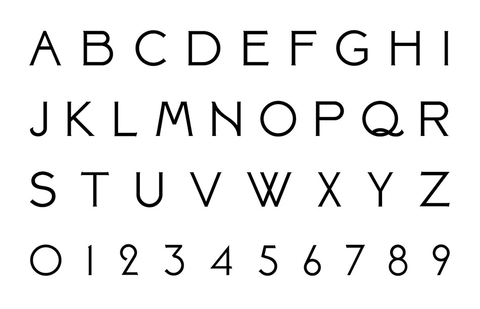


This font was designed as part of the bigger project to create a visitor center at the Quinta do Bomfim, one of the best vineyards of the Douro in the heart of the worlds oldest demarcated wine region.
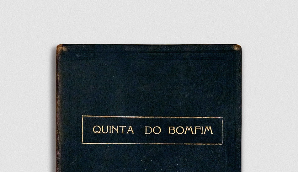
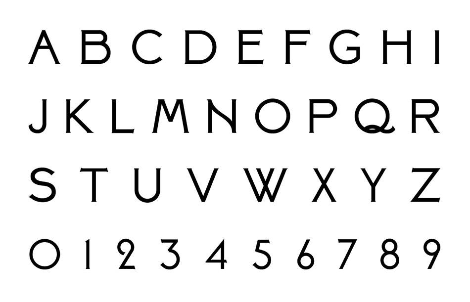
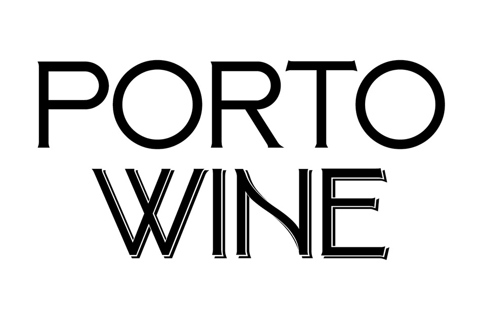
The font drew inspiration from typographic elements in an old guestbook found in the main house of the Quinta. From several elements in this same book we developed a display typeface with three variants, adopted on all design materials of the Quinta, including an exhibition, a wine shop and vineyard signage.
The font drew inspiration from typographic elements in an old guestbook found in the main house of the Quinta. From several elements in this same book we developed a display typeface with three variants, adopted on all design materials of the Quinta, including an exhibition, a wine shop and vineyard signage.
